Flexbox
Flexbox is used to structure needed for website content. used in designing responsive layouts.
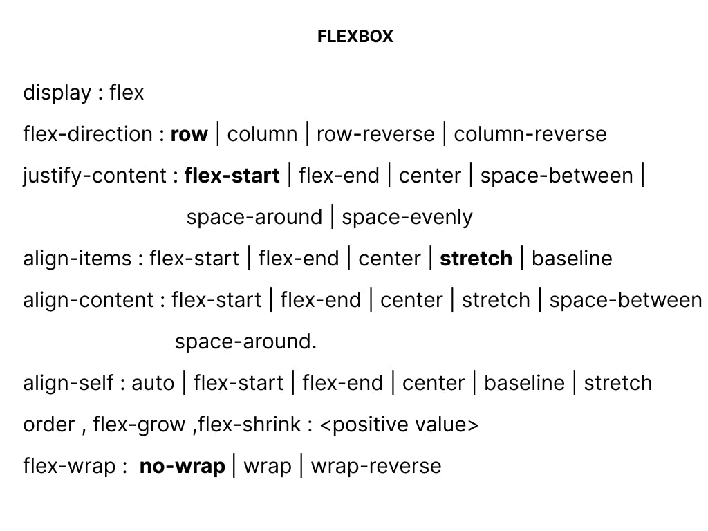
Flex property value (display:flex)
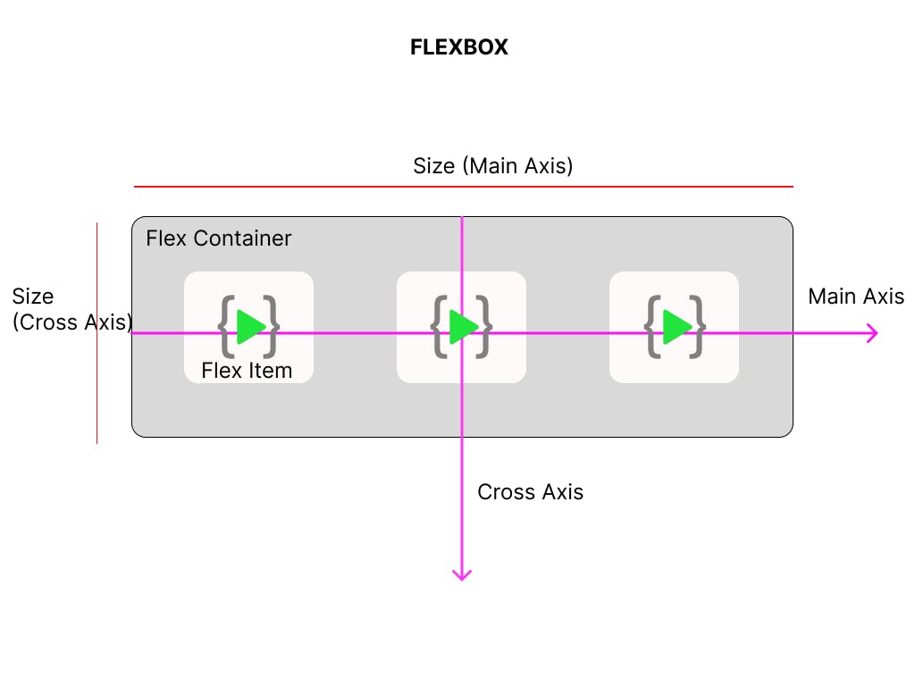
In Flex box we have two things to understand one is parent which holds the flex items and the flex items are child. parent is nothing but the container class. and the child is nothing but the items class.
display property is assigned with the value flex should be given to parent/container class
display : flex
Justify Content as Main Axis (flex-direction : row as default)


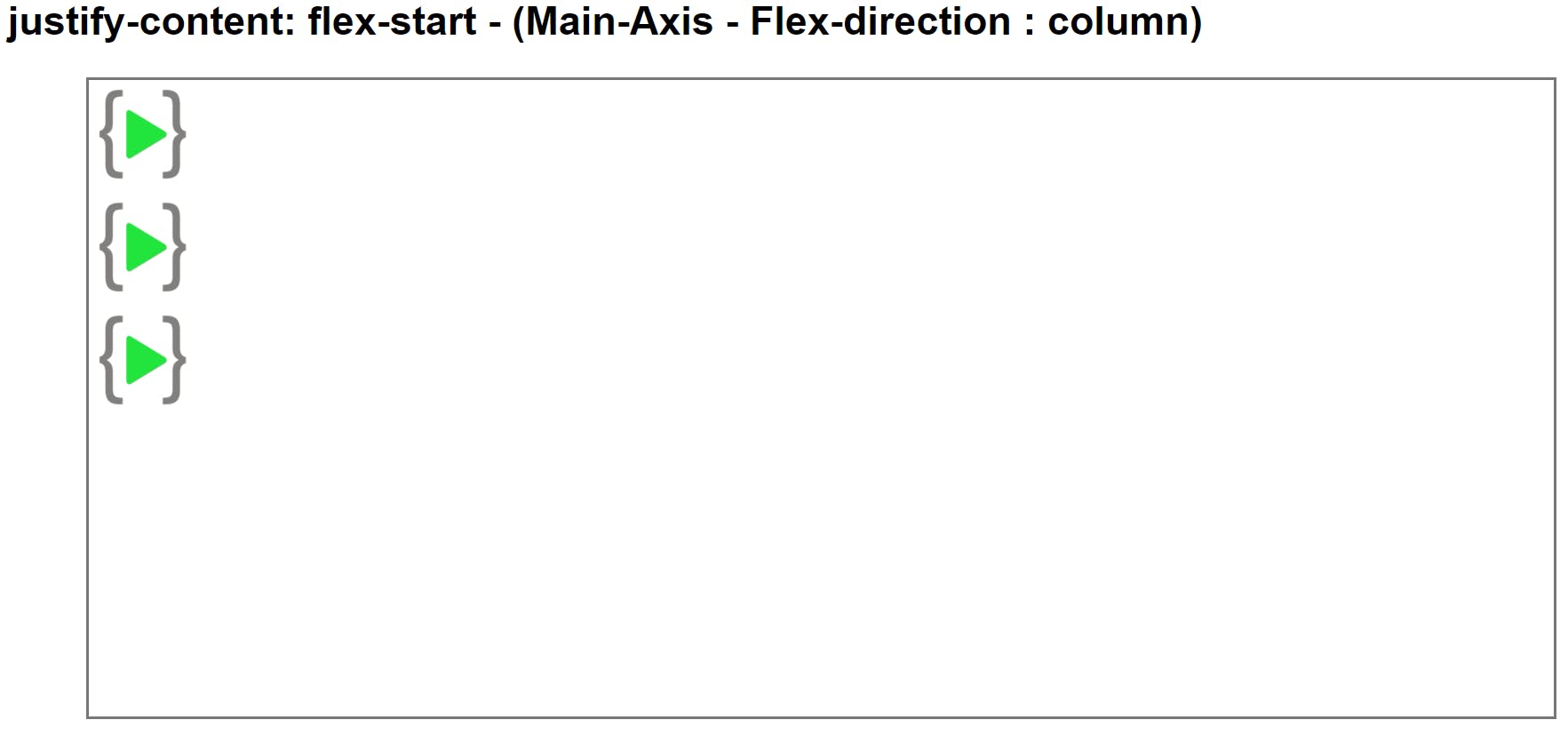
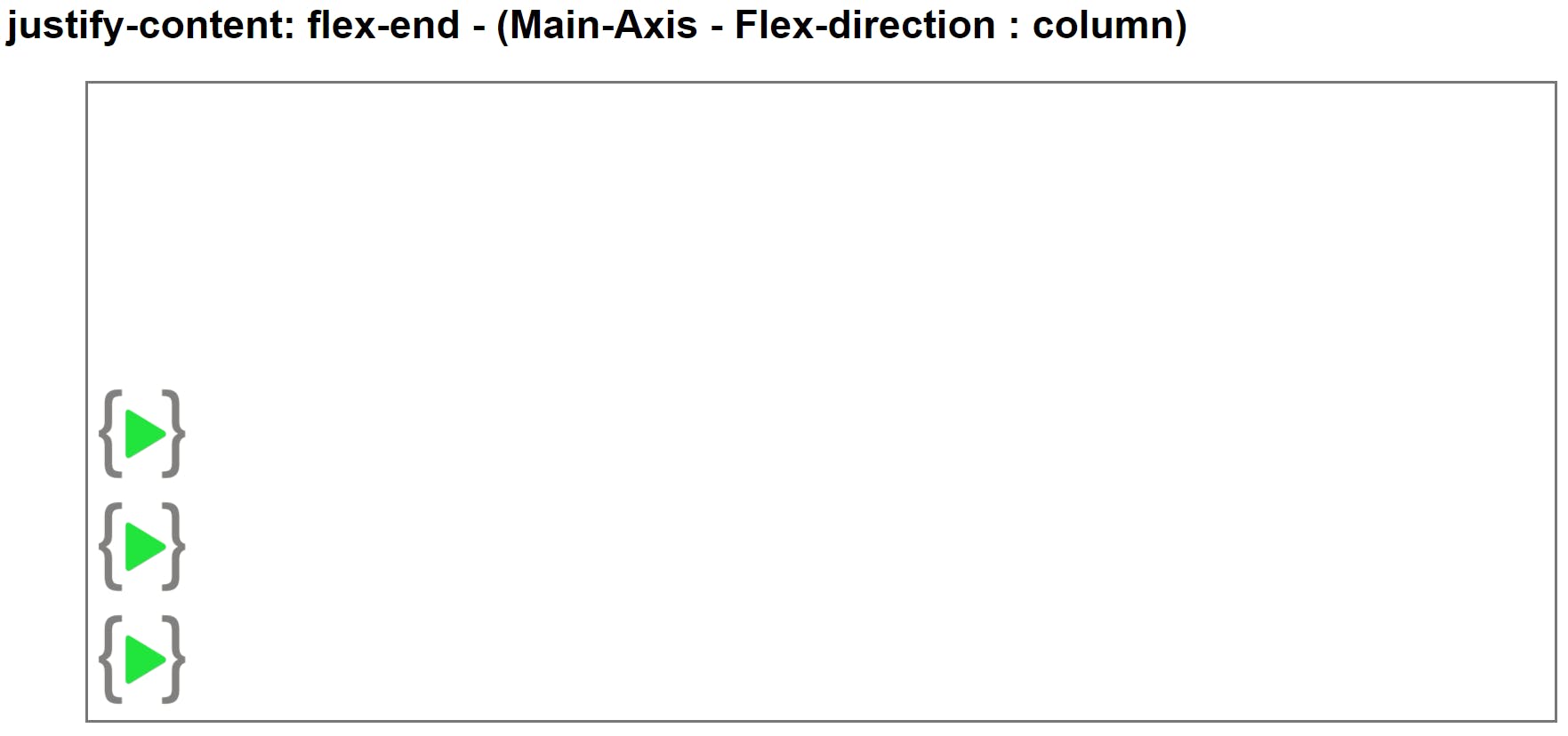
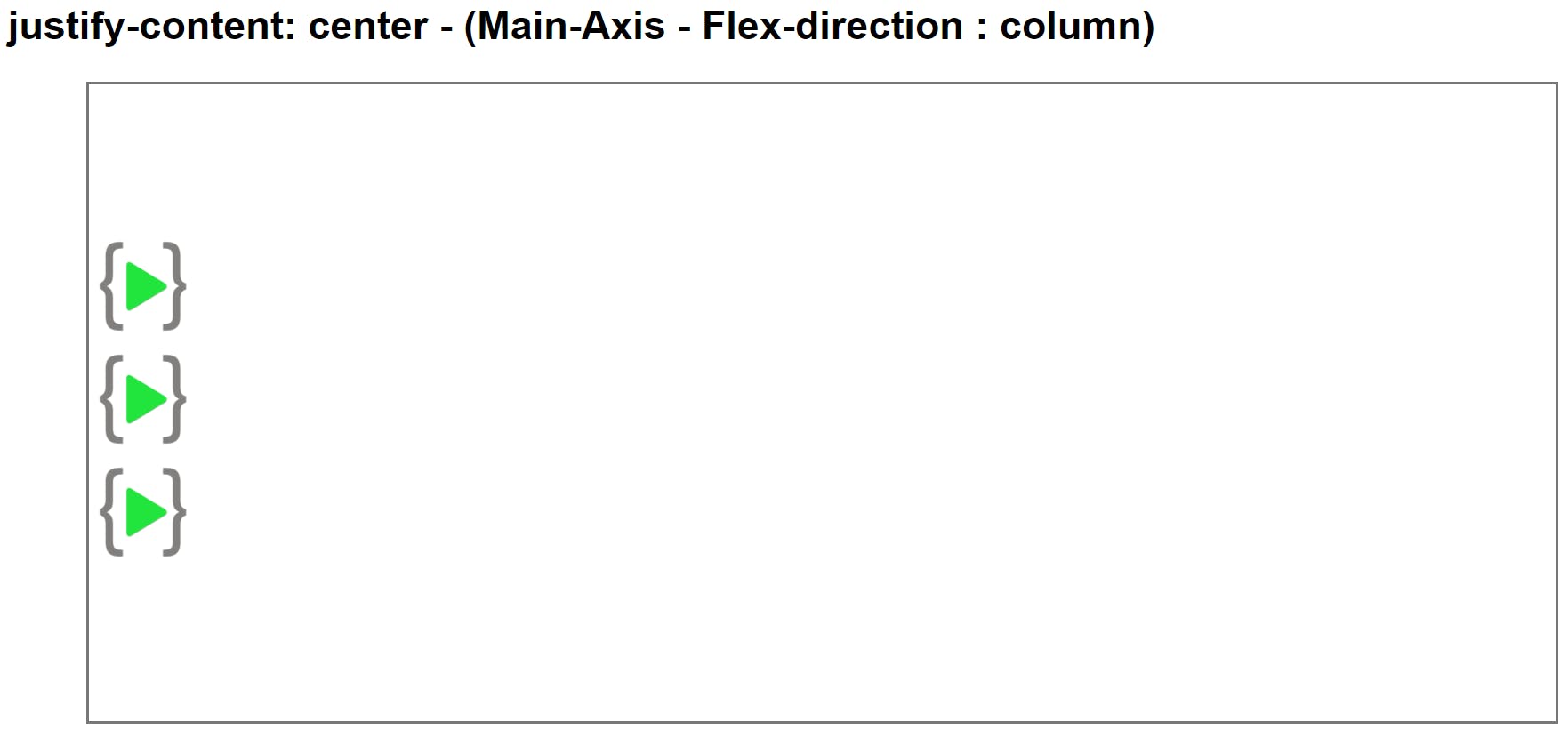
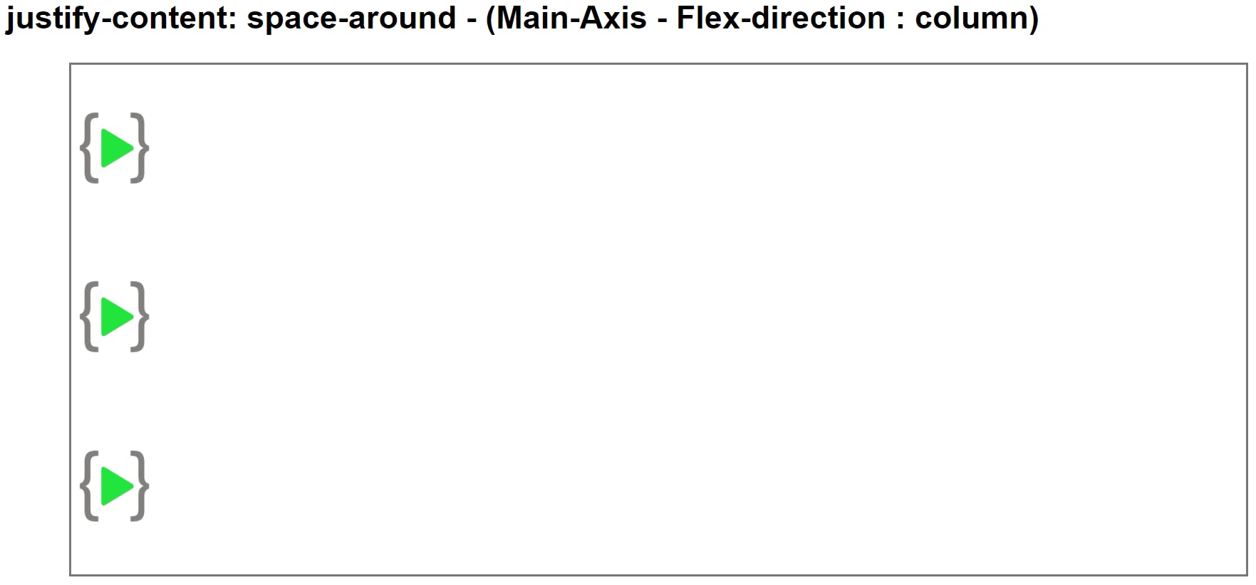
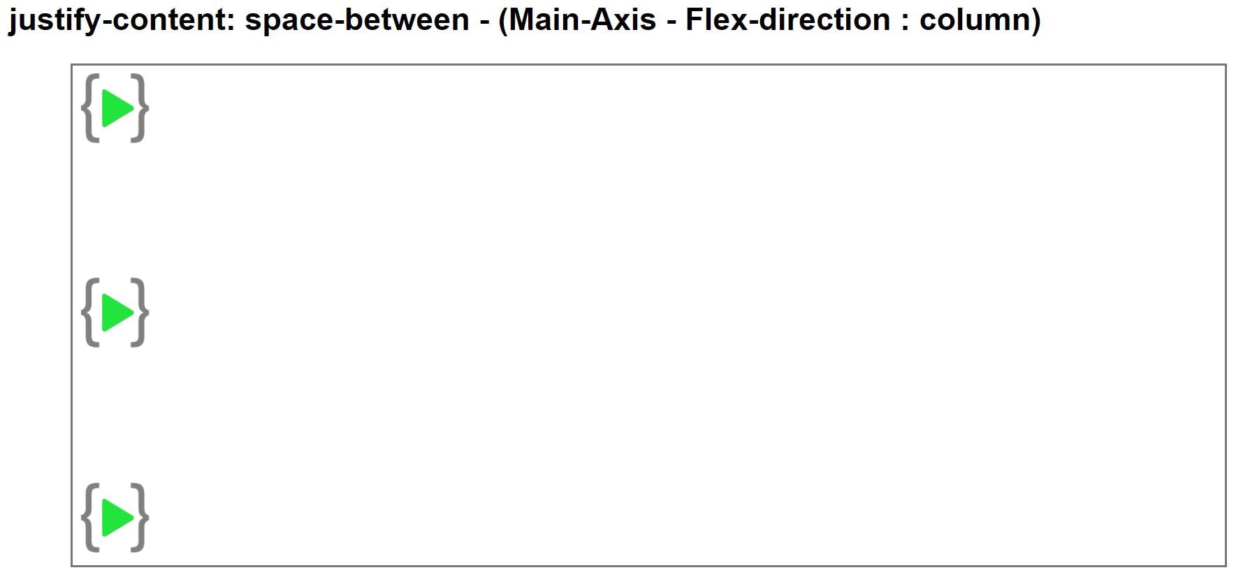
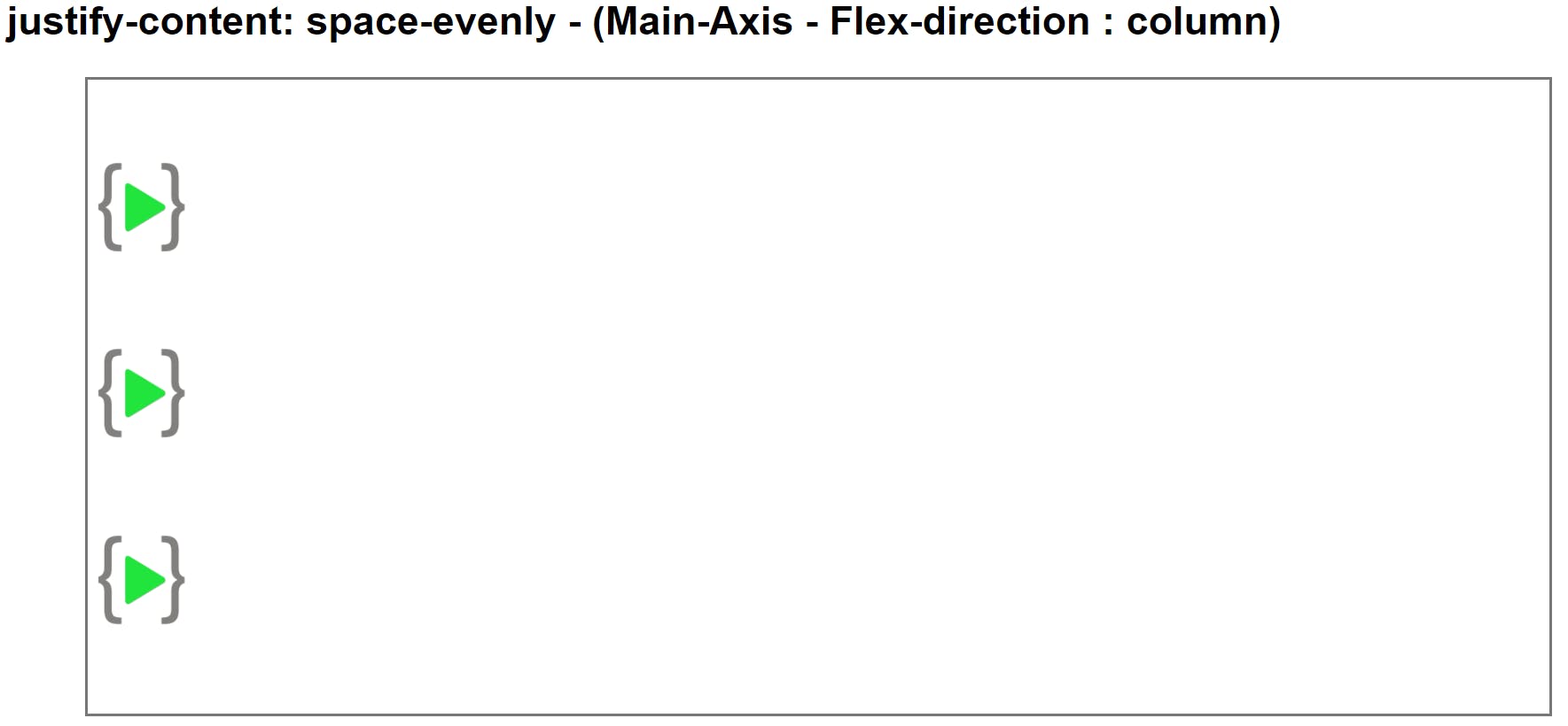
Justify Content as Main Axis (flex-direction : column as default)
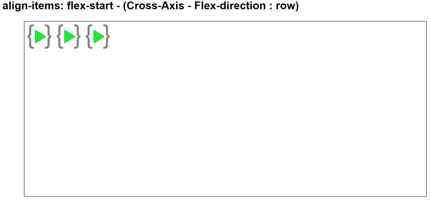
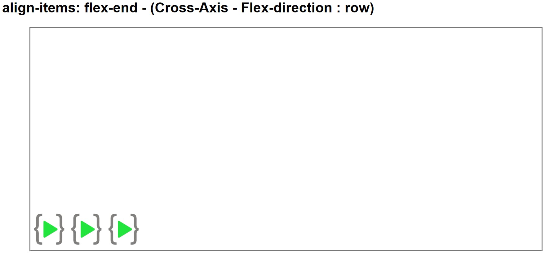
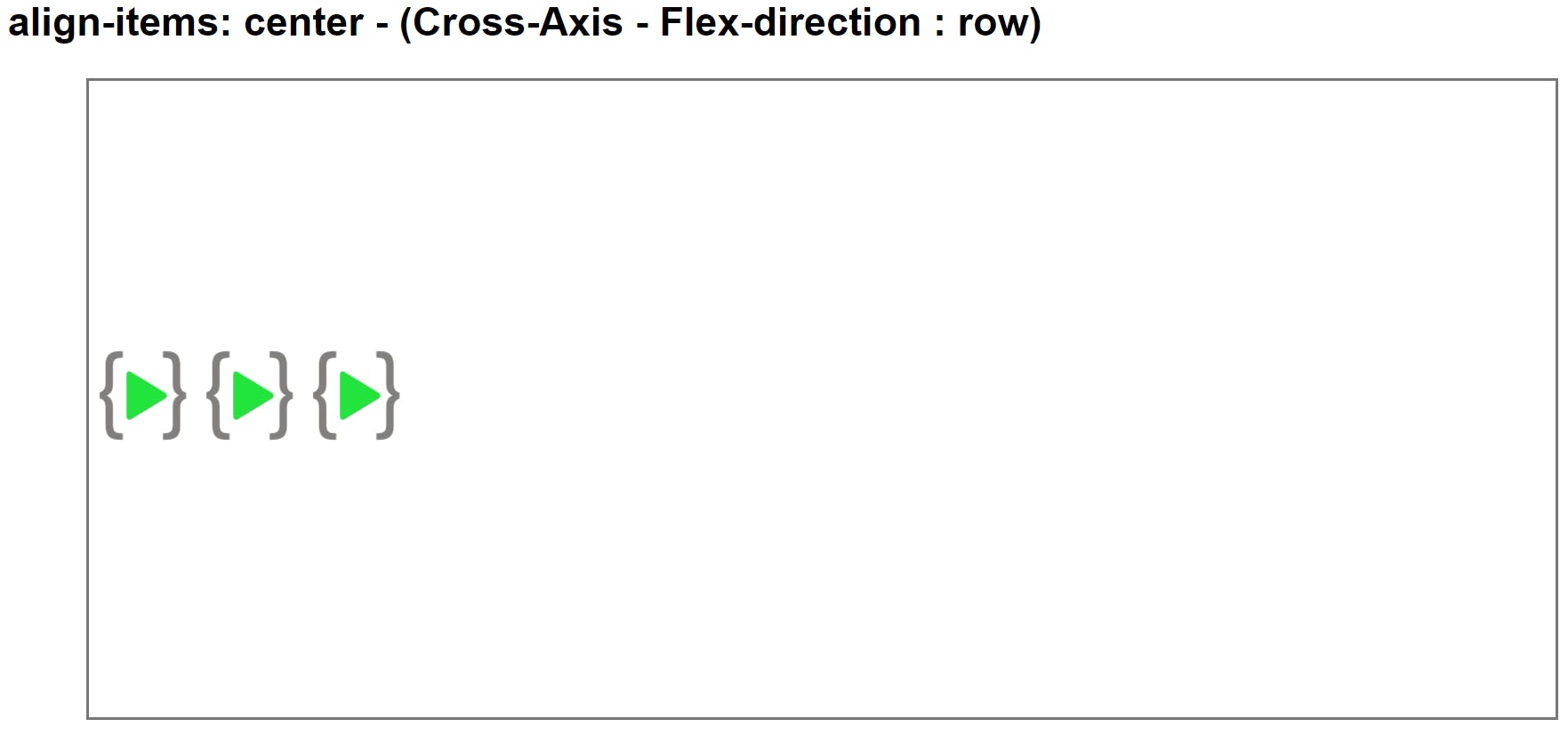
Align-items as Cross-axis (Flex-direction : row)
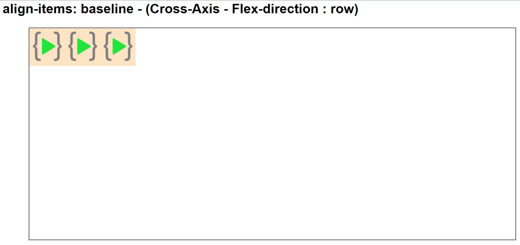
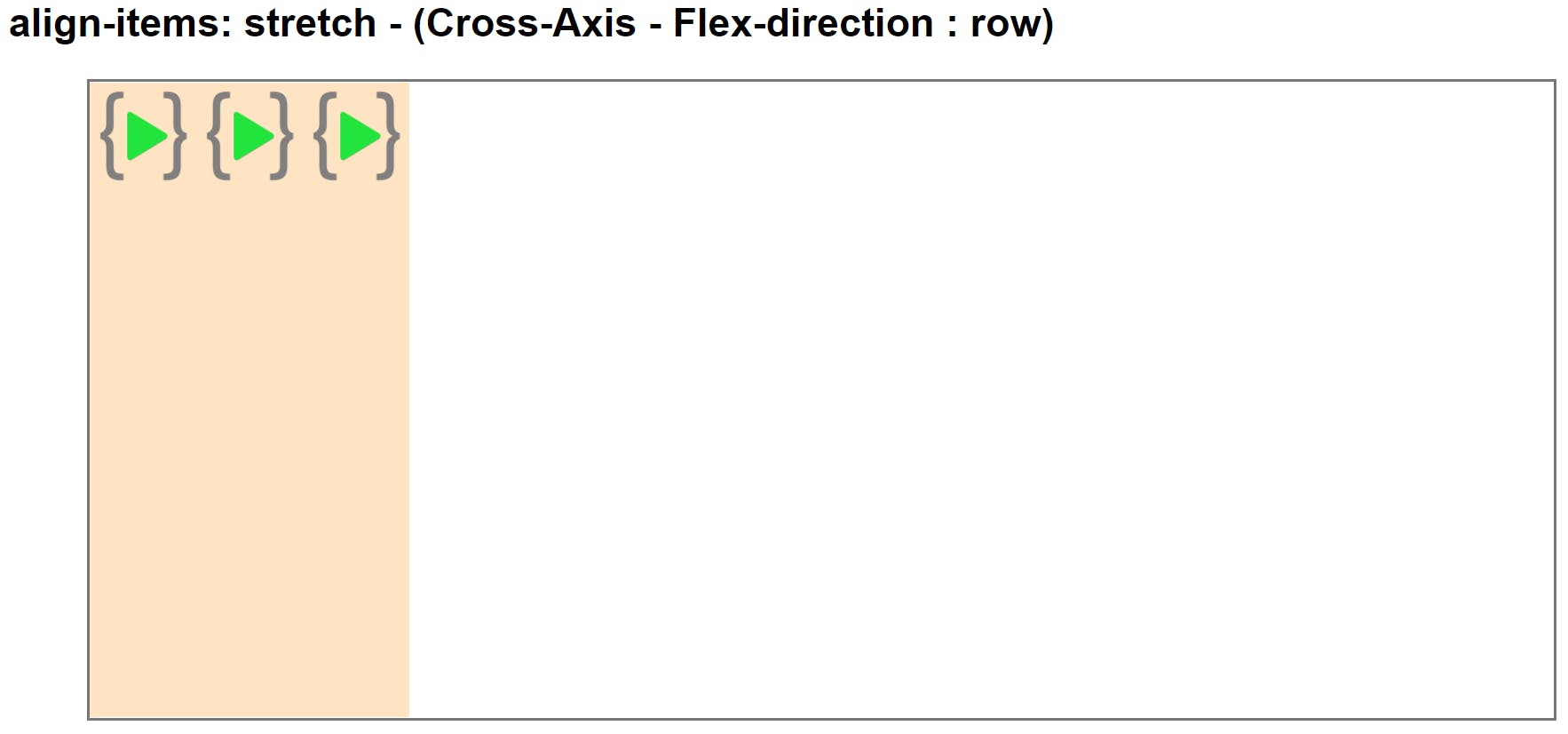
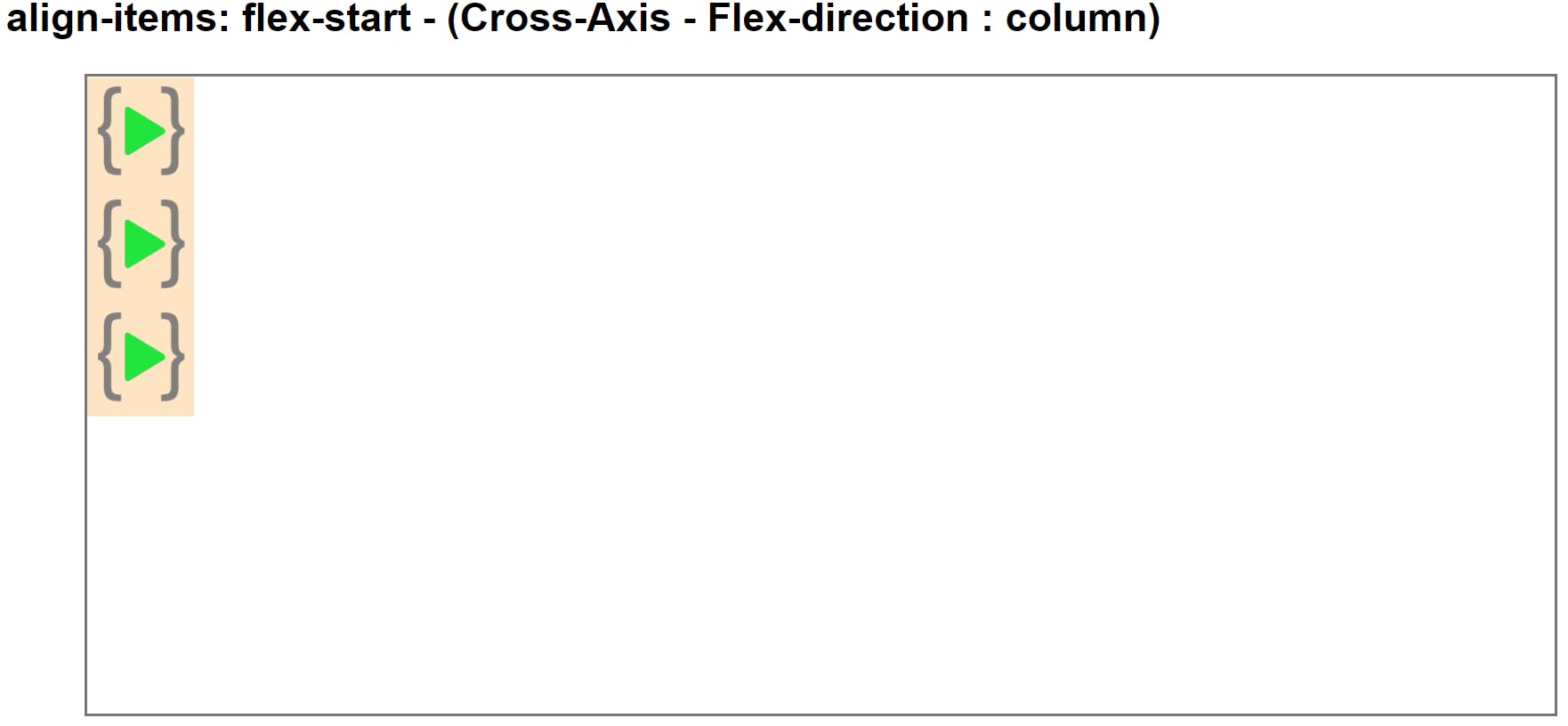
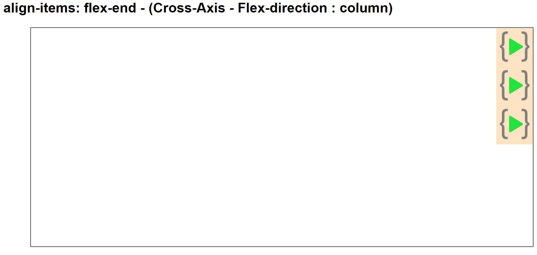
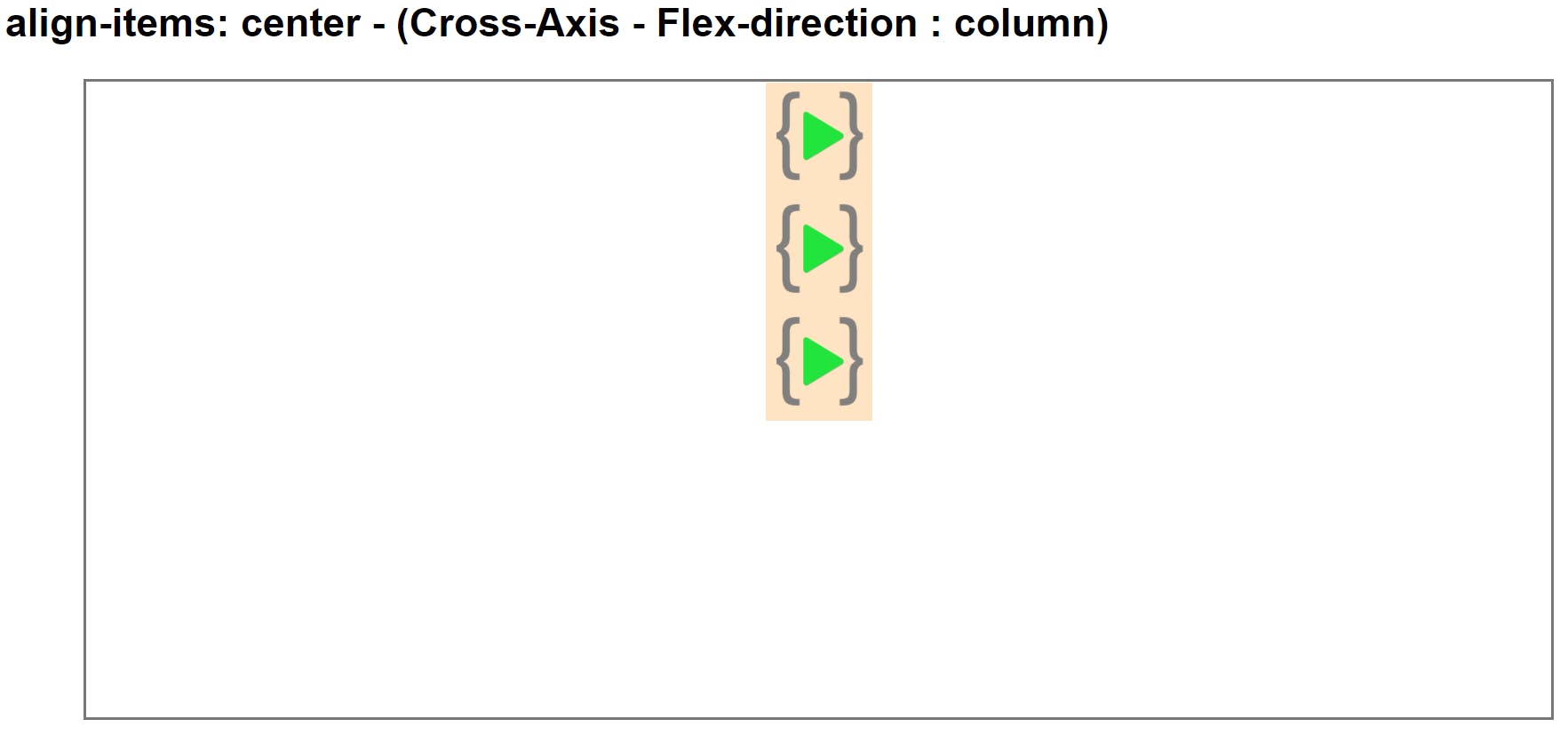

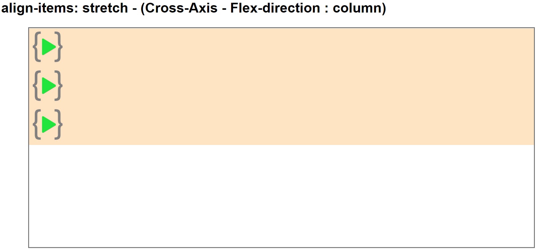
flex-direction property
This property allows us to set the direction and orientation of our flex-items inside the flex parent container how its should be arranged.
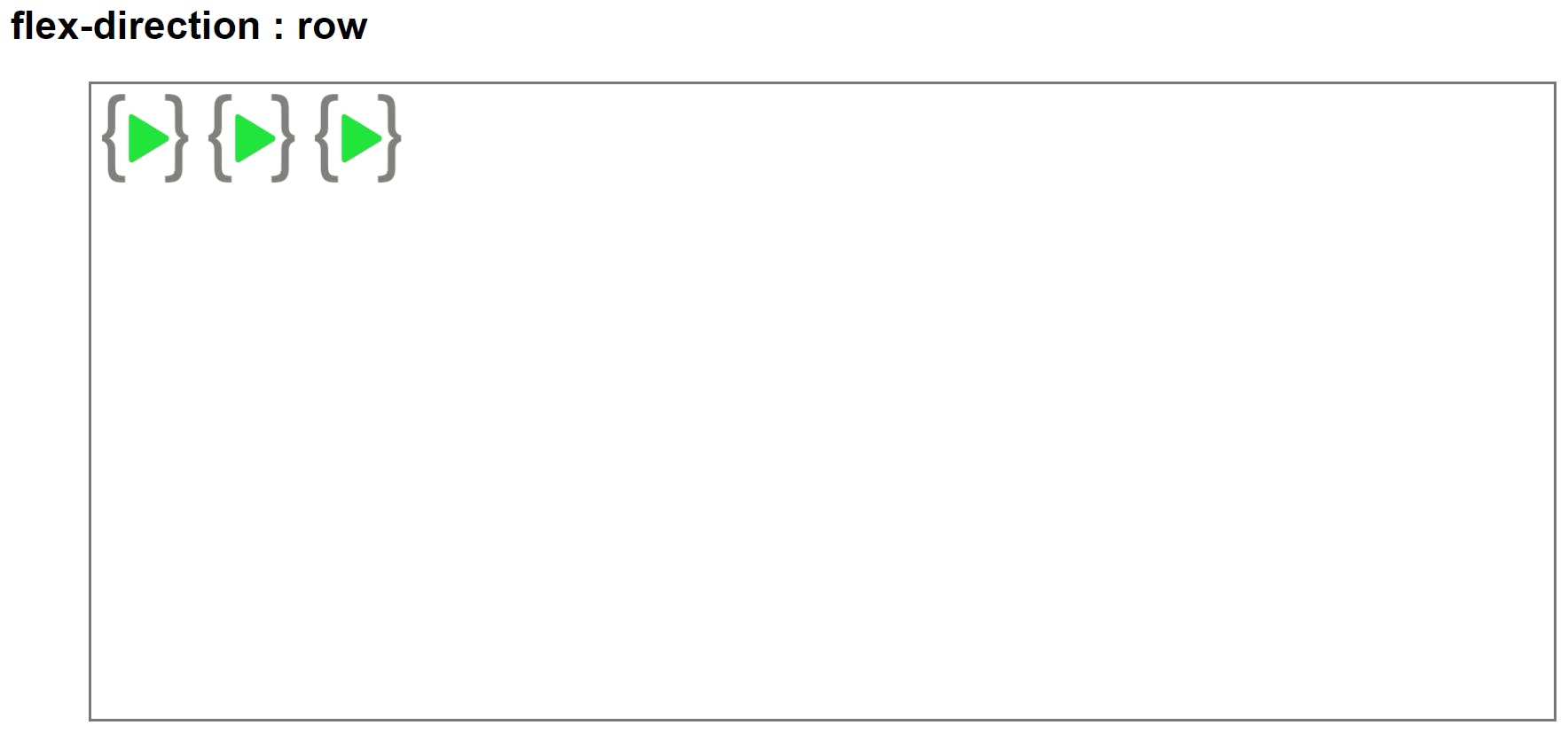
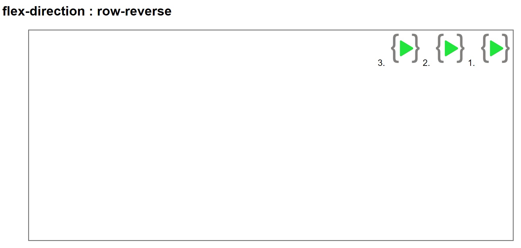
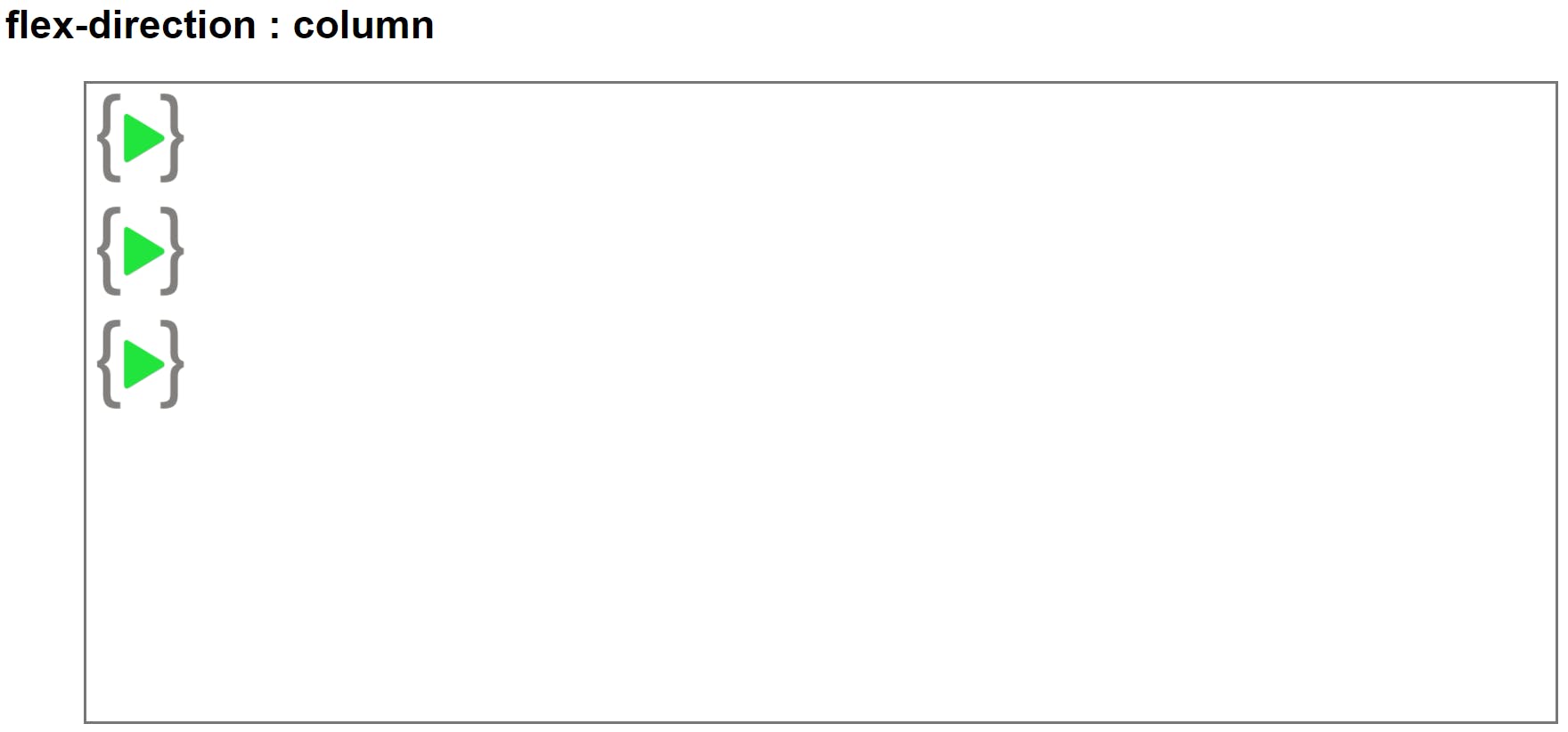
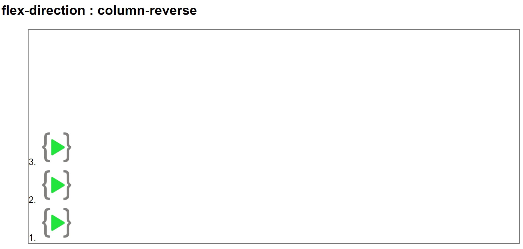
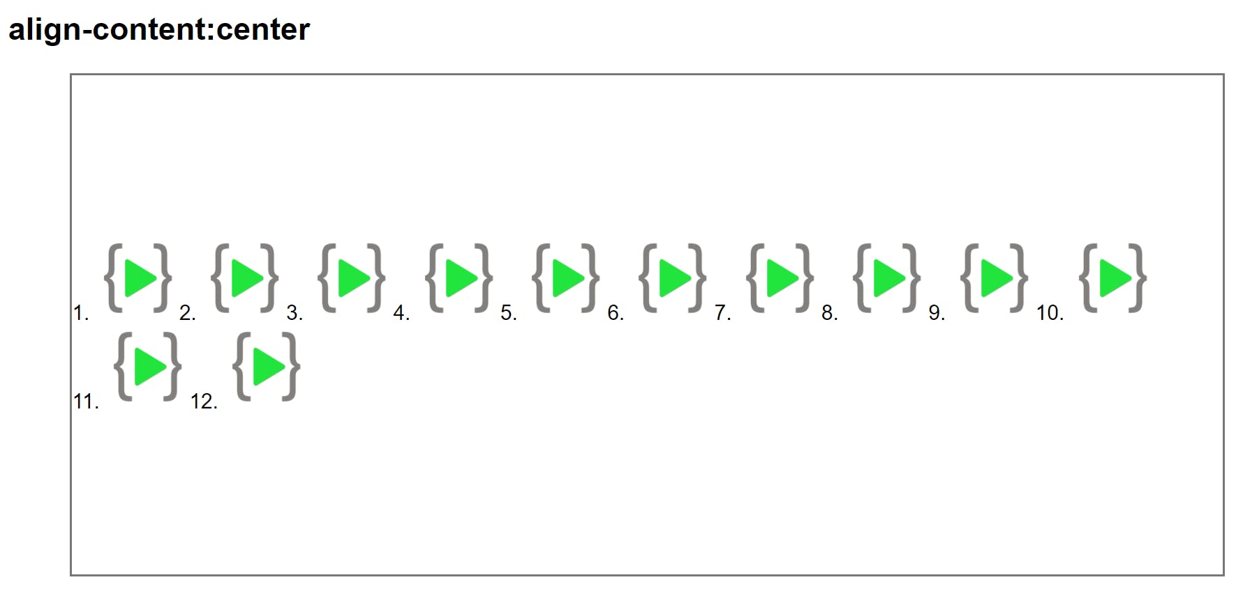
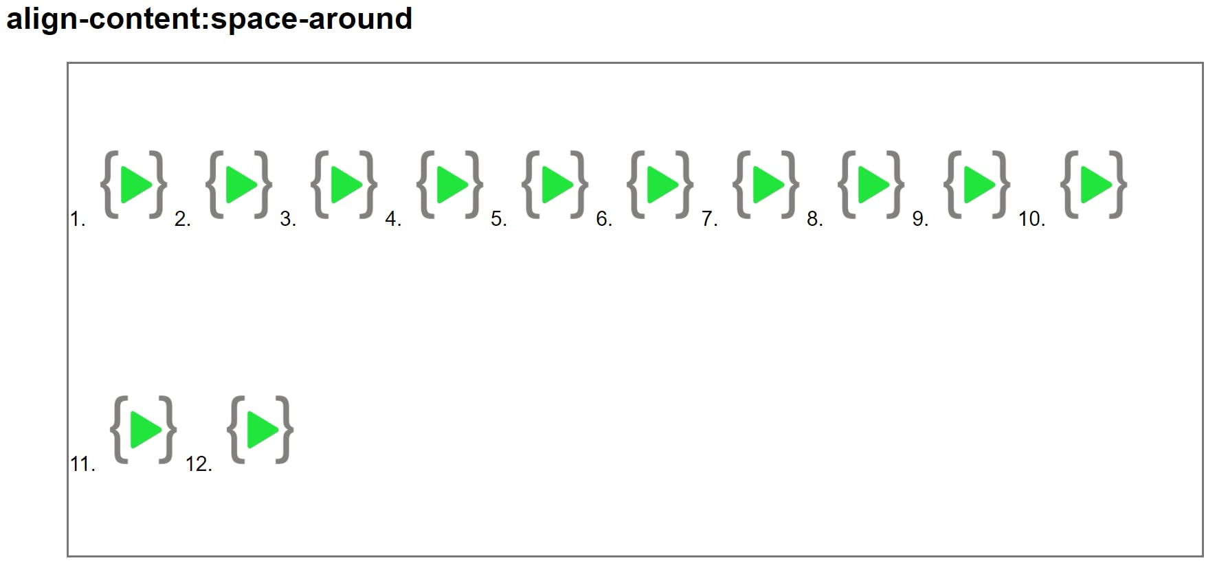
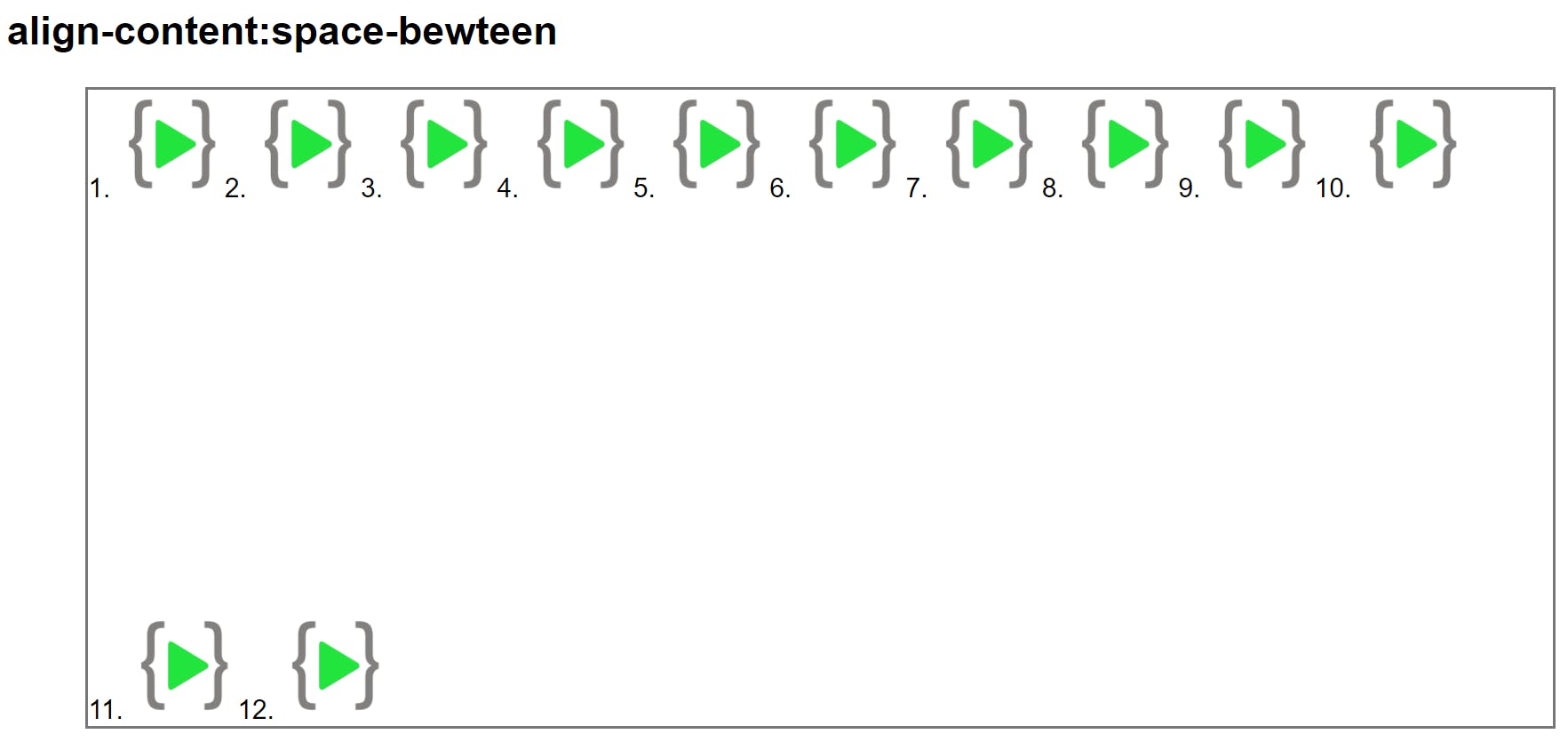
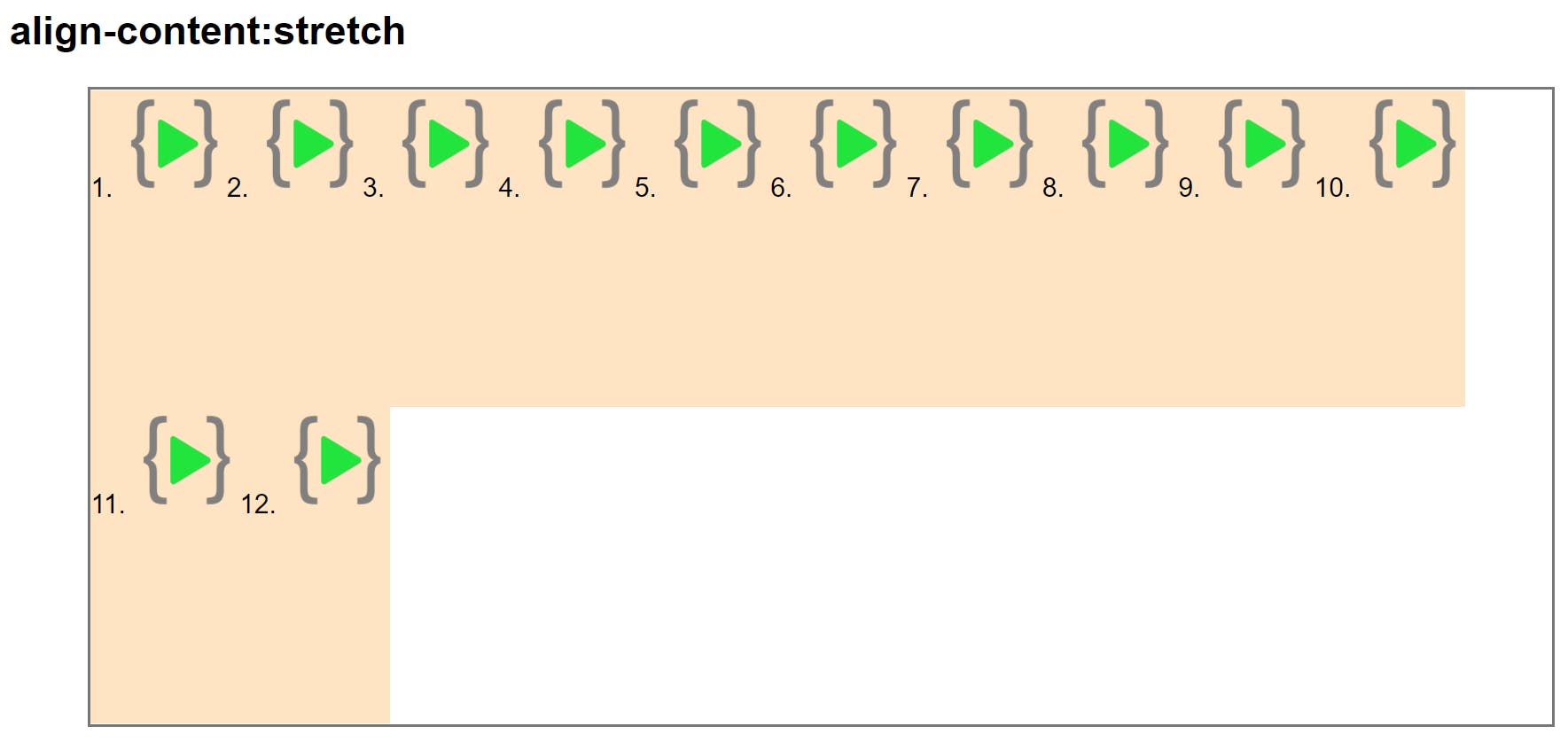
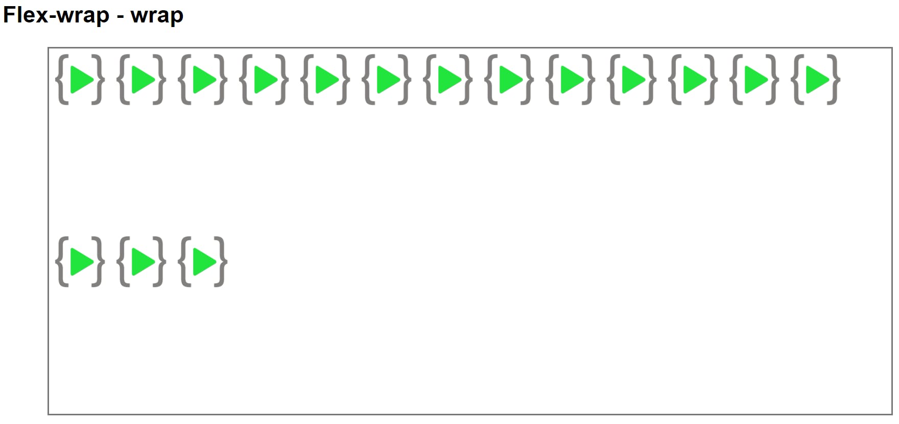
##flex-wrap Wraps the items inside the container. if wrap happens we can arrange the whole content using align-content.
flex-wrap: wrap;
align-content property
This property distributed the flex-items along the CROSS AXIS inside the parent container.
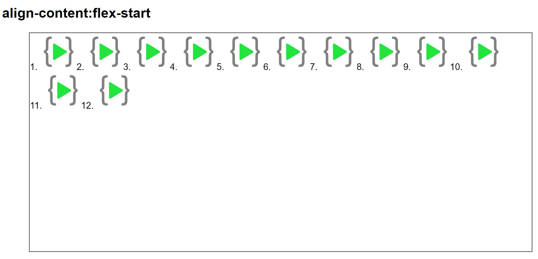
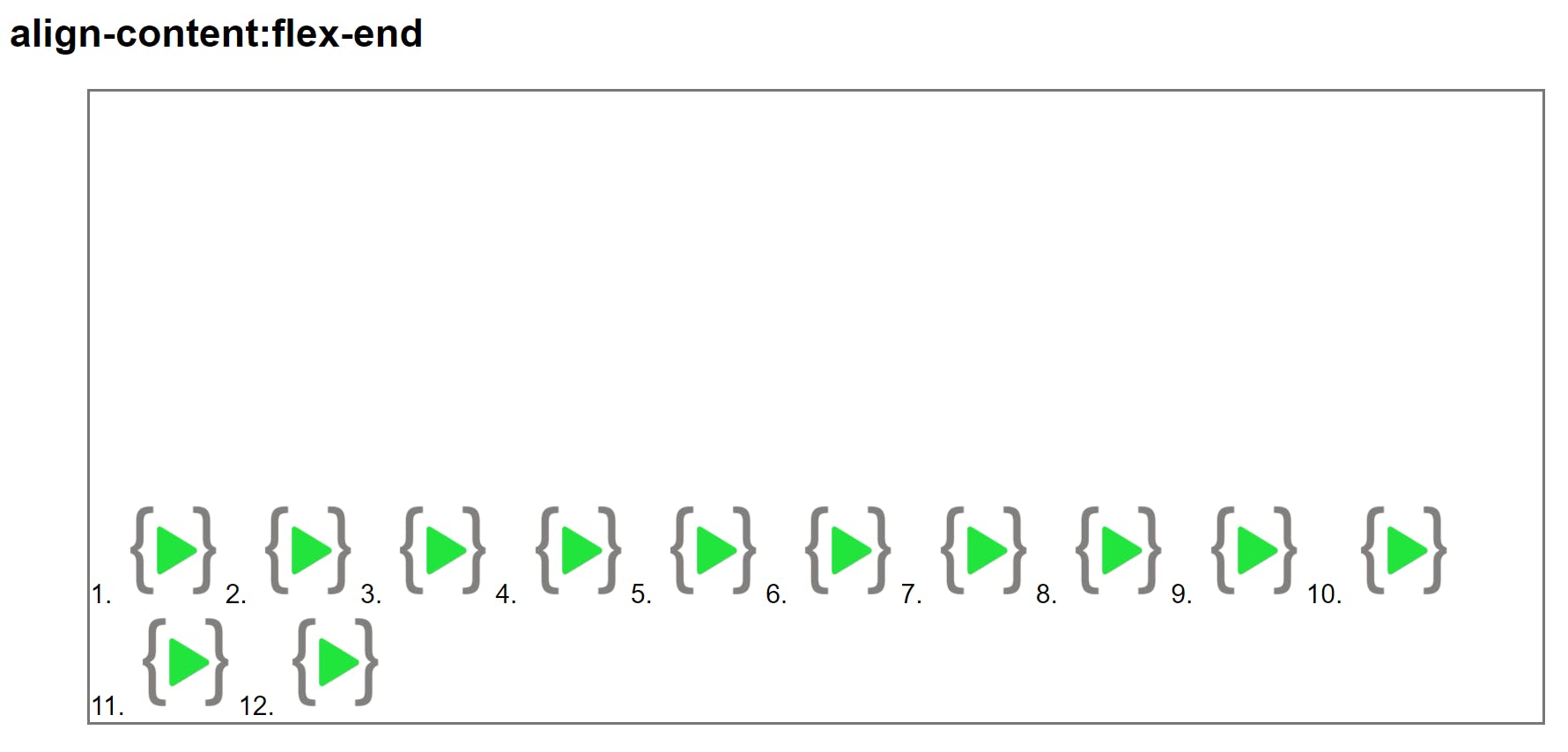
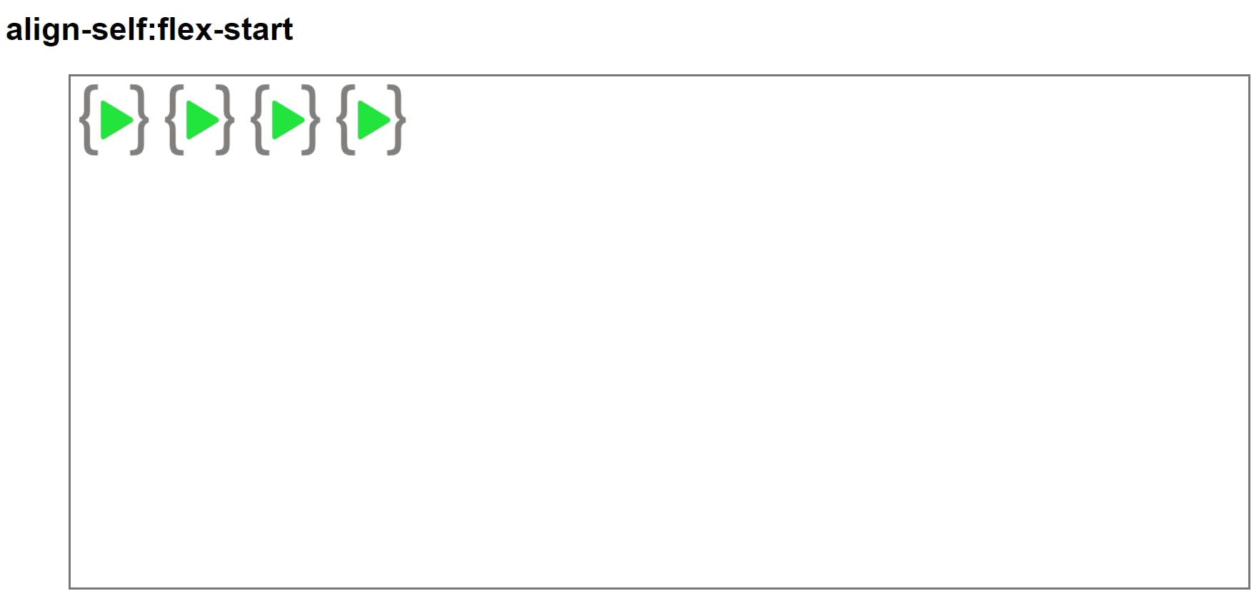
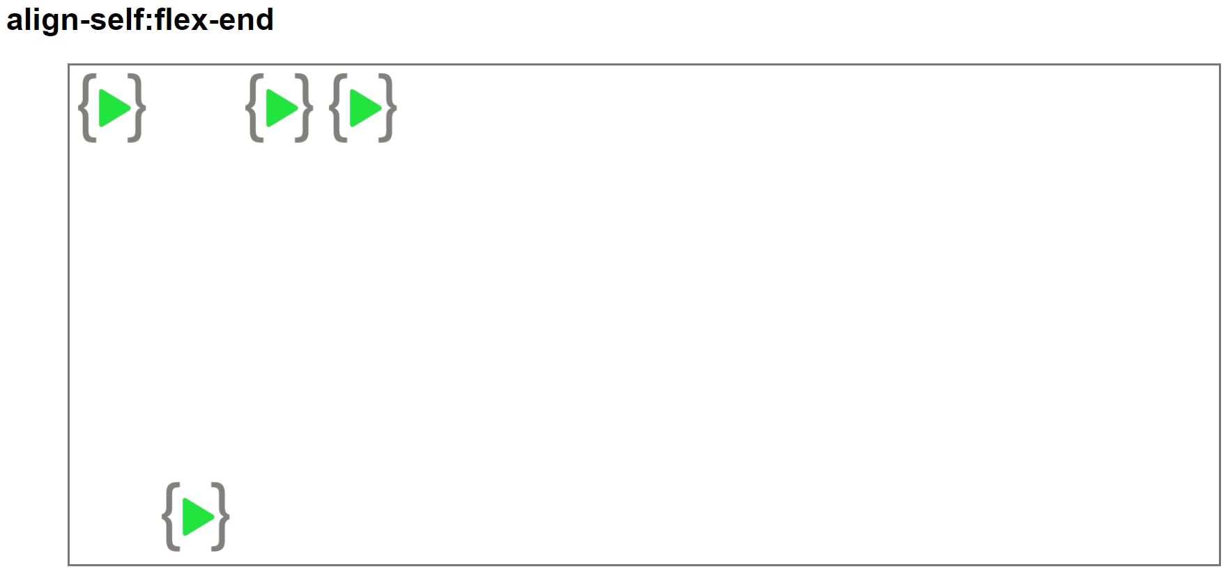
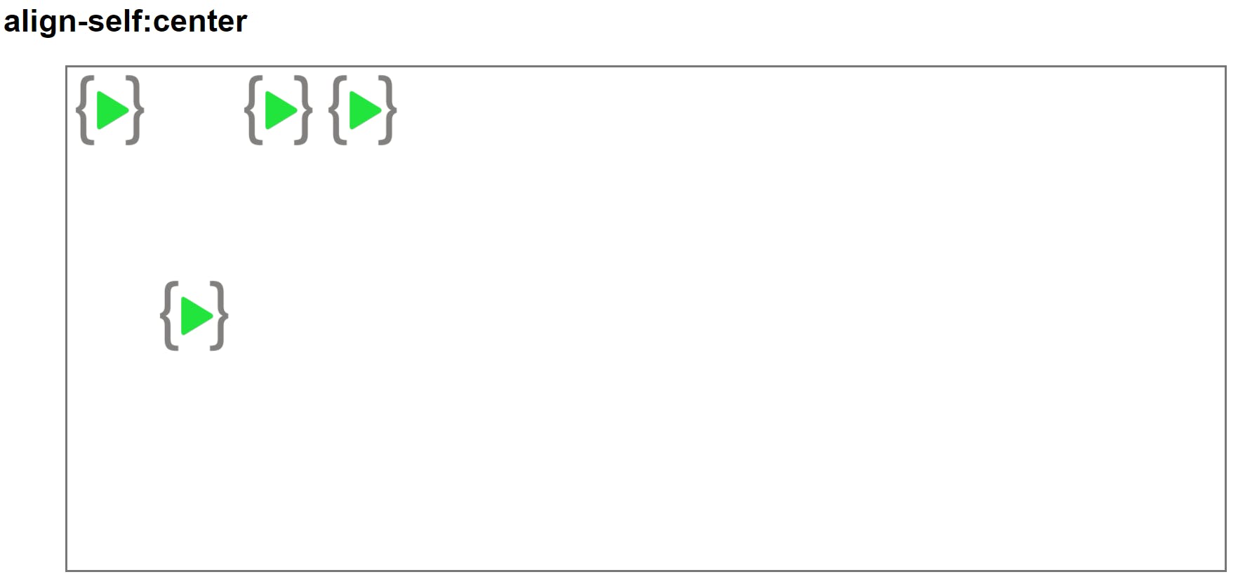
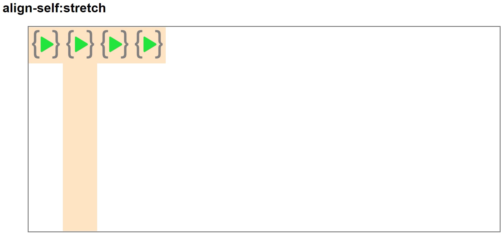
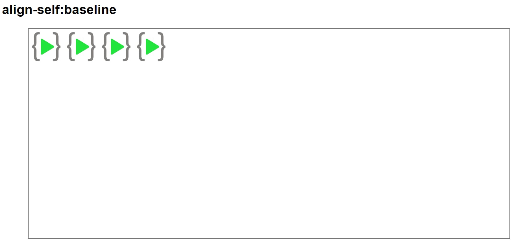
Align Self
This property works on the child classes.
flex-grow
Flex item grows based on the value given value denotes a part of the total width.

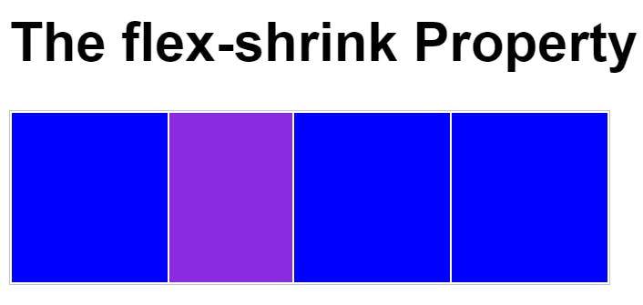
flex-shrink
Flex item shrinks based on the value given value denotes a part of the total width.
Flex wrap
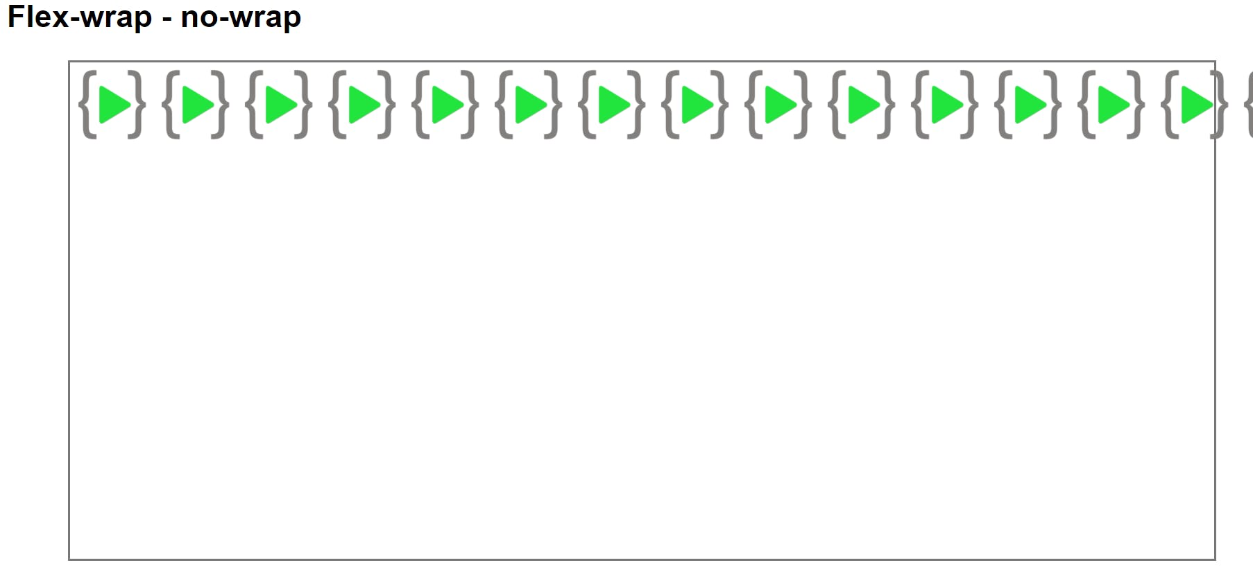
Wraps the content to next line if its not set it will align the contents in linear order.
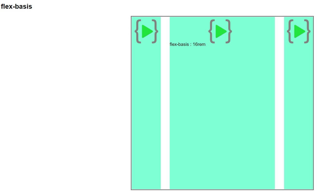
Flex Basis
Set width of the flex-item but it may vary based on flex-grow,flex-shrink in some cases
Flexbox shorthand
flex:
flex is shorthand for flex-grow,flex-shrink and flex-basis
flex : 1 2 24rem;
- first value is flex-grow
- second value is flex-shrink
- third value is flex-basis
flex-flow
flex-flow is shorthand for flex-direction and flex-wrap
flex-flow : row wrap;
- first value is flex-direction
- second value is flex-wrap
place-content:
place-content : center flex-start;
- first value is for align-content
- second value is for justify-content
Conclusion
Practice Practice Practice you will be clear.
